When Digital Gets Too Clean, Humans Get Suspicious
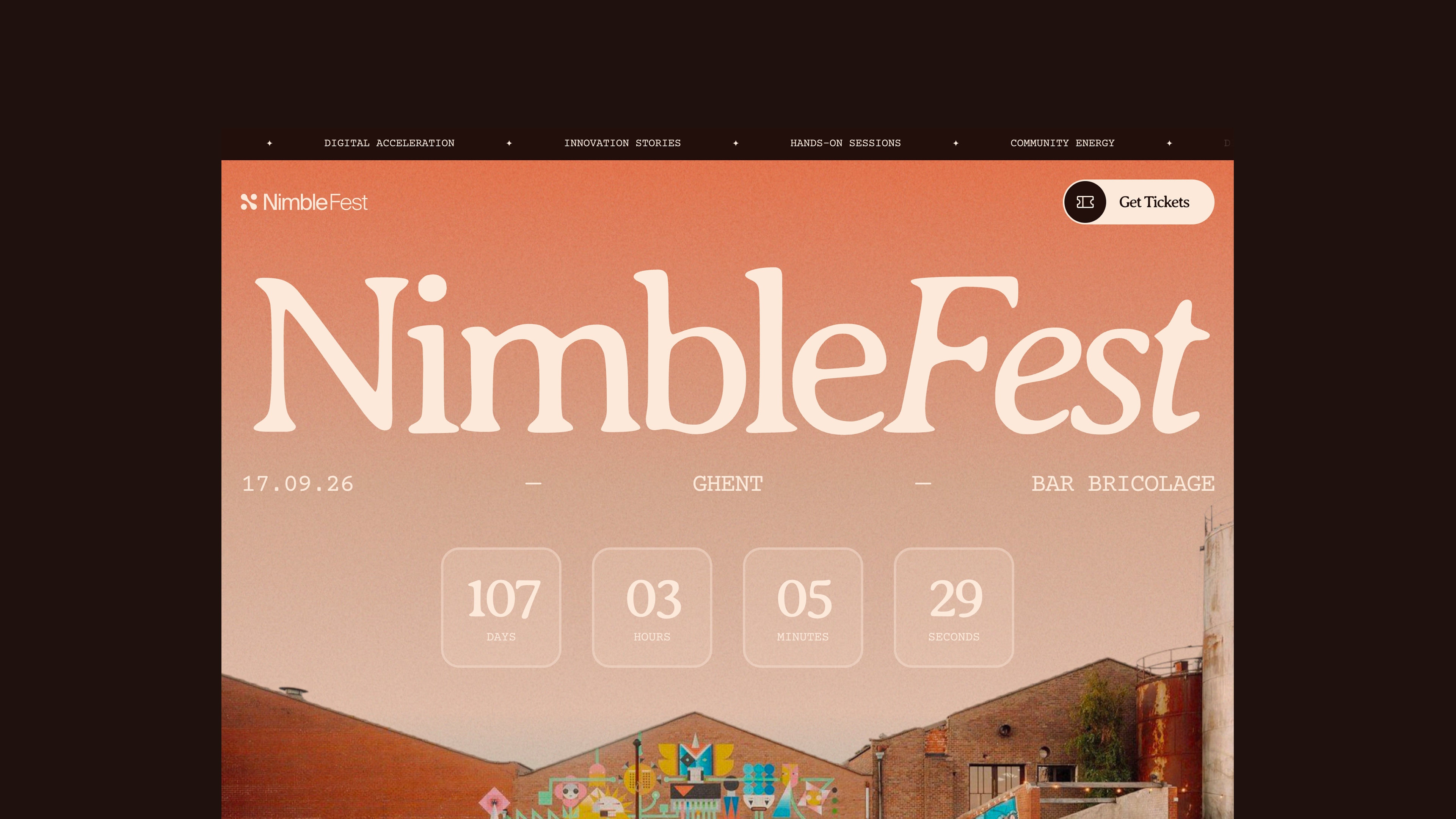
This year, we're organizing NimbleFest, our digital acceleration festival on AI-native experiences. And one of the first real decisions we had to make was: what should it look and feel like?
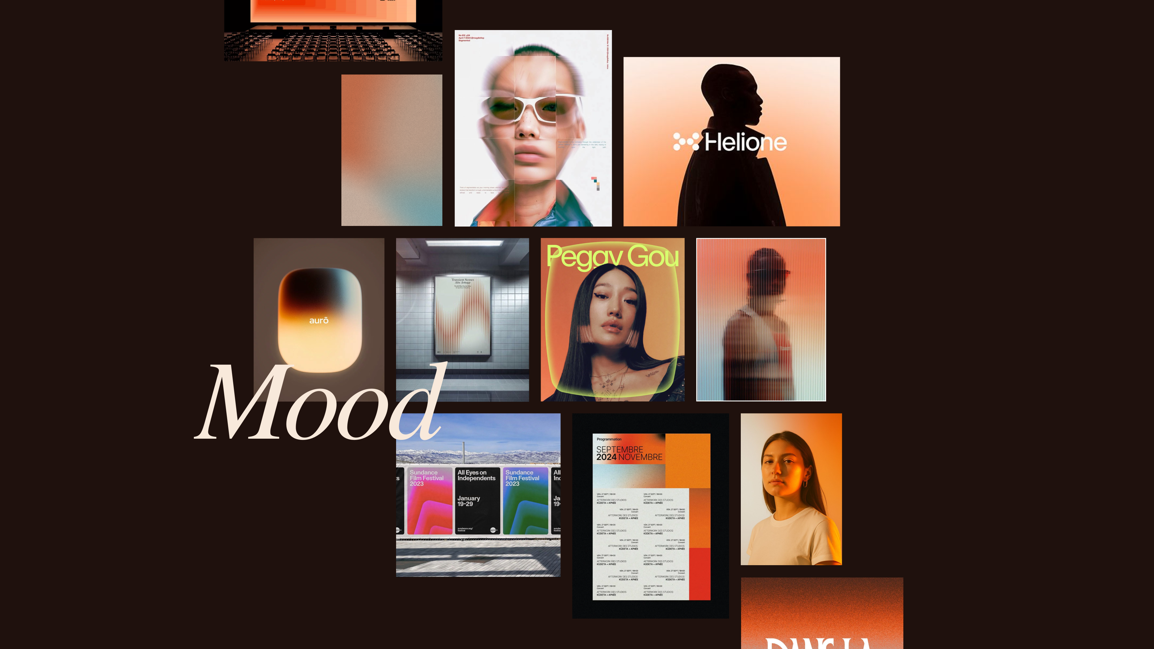
The brief we gave our designer, Ruben, wasn't "make it look techy." It was: make it feel like something humans made, on purpose, for other humans. Warm colors. Imperfect textures. The kind of craft that takes more time than downloading a Figma template. 😉
This instinct didn't come from nowhere.
Walk into any tech office in early 2026 and you'll see the same visual language: terracotta accents, serif fonts in warm cream backgrounds, hand-drawn icons with deliberately imperfect lines, 35mm film grain on promotional photography. It looks nothing like the sterile, geometry-obsessed digital aesthetic that dominated the last five years. And that is, precisely, the point.
We're living through a quiet design revolution. AI companies and digital-first brands are abandoning the polished, corporate-geometric look that screamed "algorithmic" and replacing it with something warmer, craft-forward, almost analog. OpenAI shot its ChatGPT campaign on 35mm film. Anthropic built Claude's visual identity around scholar serifs and terracotta. Granola adopted deliberately imperfect hand-drawn marks from design studio Ragged Edge. And they're not alone. Figma moved toward illustrative play. Even Allianz, a 135-year-old insurance company, repositioned its brand toward warmth and cinema.
The question isn't whether this is a trend. It obviously is. The question is why it's happening now and what it means for anyone building digital experiences that need to feel trustworthy when digital itself has become synonymous with slop.
The Anti-AI Aesthetic Is Not About Nostalgia
Let me be direct about something that design think-pieces often get wrong: this isn't a nostalgia movement. This isn't Gen Z wanting to return to the 1990s. This is something stranger and more deliberate.
Designers and founders recognize a legitimate problem: AI-generated visual language is now so homogeneous it's become invisible. The same flat illustrations, the same color palettes, the same typefaces, the same cinematic camera angles appear across hundreds of AI company websites. Merriam-Webster named "slop" its 2025 Word of the Year, defining it as "digital content of low quality that is produced usually in quantity by means of artificial intelligence." Consumer sentiment research from Meltwater shows 54% negative response to recognizable AI-generated imagery.
So brands face a genuine crisis: how do you launch an AI product without looking like AI slop?
The answer is to borrow from places AI can't easily touch. Heritage typography. Craft traditions. The texture of film photography. Hand-drawn marks. The visual language of trust institutions that have been around longer than the internet. It's a practical solution to a real problem. If everyone has access to the same generative design tools, the way to signal "this brand is thoughtful and intentional" is to do something expensive and labor-intensive and visibly human.
What This Visual Language Is Actually Saying
I'm a psychologist by training, and what strikes me most about this trend is what it reveals about how people actually decode trust in digital systems. This isn't random aesthetic preference. It's a coordinated signal about five things:
1. Craft and intention.
Serif fonts carry implicit meaning: they're associated with books, authority, permanence. Hand-drawn icons signal "someone cared enough to do this by hand." When your tool can generate everything in 30 seconds, choosing to spend weeks commissioning a custom typeface is a choice that reads differently. It says: this company will still be here in 10 years. This product matters enough to invest in.
2. Humanity within systems.
People don't actually want AI to behave like humans. Harvard Business Review research from early 2025 found that consumers specifically don't want chatbots that feel human, they want to see the humans behind the AI. Warm branding solves this paradox. The color palette and typography humanize the company, while the interface itself stays clearly artificial. It's a way of saying: we're not pretending this is sentient. But we're people who care about what this creates.
3. Visual authenticity in uncertain times.
There's genuine psychological research here. The Human Flourishing Lab found that 77% of Americans use nostalgic memories as a source of comfort when life is uncertain. We're in economically uncertain times. Climate anxiety. AI anxiety. People are reaching for visual markers of permanence. Terracotta tones, natural materials, film photography … these feel less digitally generated because they reference older, slower systems. Even if they're produced on computers, the reference matters.
4. Flight-to-trust.
This is what Allianz's rebranding explicitly signals. In times when institutions feel unstable, visual markers of stability become competitive advantages. Allianz's brand value grew 20% to $28.2 billion in 2025, with the company attributing growth directly to a "flight to trust" dynamic. When people are anxious, they don't buy the coolest-looking product. They buy the one that feels safe, intentional, and grounded.
5. Rebellion against algorithmic homogenization.
This is the one that matters most in what we're building at Nimble. Every designer, every brand strategist, every founder knows that in 2026, the cheap, fast, algorithmic approach to design feels inauthentic and risky. The warm aesthetic says: we rejected that path. We invested in differentiation through deliberation. Our digital experiences are designed by craft, not optimized by algorithm.
Why This Matters for How You Build
For us, this has concrete implications for every digital experience we're building. Consider the three flagship examples of what Nimble is working on this year:
For health and wellbeing assistants (like our work with Helan and Attentia): the gap between what an AI assistant is (a language model pattern-matching on training data) and what users need it to feel like (a trusted care guide) is massive. Warm design language bridges that gap without lying about it. A care assistant with a terracotta accent color and serif headlines and hand-drawn health icons still reads as "tool" but it reads as a thoughtful tool. The visual language says: someone who understands care designed this interface.
For energy advisors (Energie.be and our work in the energy transition space): fossil fuel companies had decades to establish trust through traditional corporate branding. Renewable energy and AI-enabled grid solutions are newer, more uncertain. A warm, craft-forward visual identity signals stability without claiming false heritage. It says: this is modern AND intentional AND here to stay.
For empathy-first claim handling experiences (insurance, risk): this is where the psychology gets most interesting. People file claims when they're vulnerable. They don't want to feel like they're talking to an algorithm optimizing their claim down. Warm design language doesn't fix the underlying power imbalance, only fair policy design does that. But it changes the feeling. It signals: we remember you're a person. Your situation matters more than processing speed. 🤝🏻
The Risk: When Humanity Becomes Another Template
This is where the honest caveats matter. The moment I noticed this trend coalescing across dozens of brands, I also noticed what happens next: the warm aesthetic becomes another template. Another checkbox. Another Figma component that every AI startup copies.
Android designer Forest Young predicted this in Fast Company's 2026 brand trends: "AI will make mediocre work even more mediocre. But for those who truly understand design... AI is just another tool to make extraordinary work." The implication is clear. Terracotta and Quadrant serif and hand-drawn swirls are the current markers of thoughtfulness. Once every SaaS startup adopts them, they stop being markers and start being noise.
There's a second risk, too. Designer and it's-nice-that contributor Elizabeth Goodspeed put it best: "If the goal is to prove something wasn't made by AI, faking 'realness' on a computer doesn't really get us anywhere new." You can commission a photographer to shoot real people on 35mm film. But if the art direction, the color grading, the composition, the subject matter all follows the same strategic brief as every other AI company, you've just made an expensive version of slop.
The brands that will win in 2026 aren't the ones that adopt the warm aesthetic because it's trending. They're the ones that use it as scaffolding to do something actually distinctive: naming real customers, crediting real designers, showing actual process, building experiences that reflect genuinely different values about what human and machine should do together.
What We're Committing To
At Nimble, we're building toward NimbleFest partly because of exactly this insight. Our theme, building AI-native experiences that should still be human, isn't a tag line. But it's an acknowledgment that the visual language of your brand, the craft signals you send, and the actual design of how humans interact with AI systems all have to cohere.
We're committing to:
Real craft over aesthetic borrowing. If we're using serif typography, we're doing it because it aligns with how we think about these products: as careful, intentional systems built to last. Not because it's trendy. If we're working with hand-drawn iconography, it's because the people using our products deserve to feel like someone cared about every pixel, every interaction, every edge case.
Transparency about the humans involved. We're naming designers, crediting photographers, showing actual process. Our branding doesn't pretend to be purely algorithmic or purely human. It's transparent about being both.
Experiences, not just aesthetics. The warm visual language is scaffolding. What matters is whether your health assistant actually listens. Whether your energy advisor gives you information you can act on. Whether your claims experience treats you like a person, not a data point. Design language is the signal. The product is the thing.
The Closing Question
Digital gets more sophisticated every month. AI gets more capable. The risk is that both become so polished, so optimized, so indistinguishable from everything else that they feel more distant from actual human need.
This warm design language is, in a weird way, a bet against that outcome. It's a choice to slow down intentionally. To invest in signals that someone cared, not just in how the interface looks, but in what it does and who it serves.
That's what building human-centered AI experiences actually means. Not making machines feel warm. Making the organizations behind them prove they remember what it means to care. 🫶🏻
NimbleFest is happening because that work matters. We're building the tools. The design language just helps people remember why.
