Imagine you're at the head of one of your country's biggest banking and insurance companies. You've successfully transitioned from being a traditional bank to a leading mobile banking provider. But competition keeps getting more intense, with many digital-first competitors jumping to the scene with alluring value propositions.
Your best bet, considering your position, will be putting everything you got on delivering the best possible customer experience. And nowadays, the by far biggest chunk of that experience takes place in the app. So, your objectives are clear; you have to build the best possible banking app, and continuously improve on it to avoid the risk of falling behind.
This is the challenge that Belfius, one of Belgium's biggest banking and insurance companies, is currently facing. Belfius insists that they must maintain its best-in-class customer experience. It's their mission to become recognized as the best digital banking services provider in Belgium – even when pitted against digital-only competitors.
Seems like a spicy challenge, right? Well, Belfius has shown it can be done. In this article, we'll explore how exactly they're able to improve the user experience (UX) of their mobile banking application, despite the massive scale they operate on.
Two major barriers to digital innovation
You can imagine wanting to tinker with an app that's being used by literal millions of people, isn't as straightforward as just asking the guy in charge. Especially when you're a bank. Not only that, in companies that harbor hundreds of employees, teams usually aren't set up to accommodate for this way of working. This is largely due to a high level of complexity in organizational structures. In other words, I can see two big reasons why people would be hesitant or unable to subject their website or application to continuous improvement, or rather, to innovate:
👉 Innovation is never without risk. But the perceived risk of not innovating at all, is much greater. Especially larger companies are very aware of the fact that young, fast-moving companies have the ability to disrupt the game. Given how fast-paced everything is, more and more businesses are waking up to the idea that whoever gets things done the fastest, has the best shot at winning. They also know that, because of their size, their ability to create and launch quickly has been slowed down regardless.
👉 Continuous delivery also requires a self-organizing team where all the necessary expertise and skillsets are present. In larger companies, however, different people with different skills are often siloed off across departments. This immediately creates a deficit in terms of communication and planning. A single person spearheading the team, is therefore also missing in this case. Not only that, this team should also be able to act independently, another thing that's difficult to accomplish in larger companies.
So that begs the question, how does Belfius deal with these hurdles? Is there a scenario where they can experiment more freely? We can probably find some answers when we look at Belfius and Proximus' latest joint effort: Banx.
The case of Banx
In case you're unfamiliar, here's a quick rundown. Belfius recently took a brand-new banking application, called Banx, to the public. Banx is the fruit of a dedicated partnership between Belfius and Proximus, a Belgian telco company and ISP. Together, over the course of a mere 15 months, they were able to launch this new mobile banking experience. Imagined by Proximus, powered by Belfius.
Banx is entirely digital. No offices, no physical paperwork, and none of those weird, recurring costs a traditional bank might hit you with. Its biggest selling point is their relentless focus on sustainability. Clients have access to a personal CO2-dashboard, where they can get an idea of the ecological impact of their spending habits. Banx has also partnered up with numerous sustainable companies to offer rewards to people for using the app. The idea there is nudging people to make more sustainable buying choices. Think fashion, utilities, groceries, pet food... You name it.
That said, why is Banx relevant to this story about Belfius? For one, the UX (User Experience) of the Banx mobile application, is largely based on Belfius' existing banking app. Which makes sense; there's no need to completely reinvent the wheel, and the Belfius app itself was ranked as being absolute world-class to begin with. Secondly, Banx has only been available to the public for a very short time, meaning the number of recurring users is obviously still on the lower end. Can you tell where I'm going with this? That's right, a smaller audience means less risk, meaning a lower threshold to start experimenting with UX!
The user experience and why it matters
That's all fine and dandy, but why UX specifically? Many people tend to confuse UX design with UI (User Interface) design. Which is understandable, considering it's a bit of an abstract term anyway. In reality, UI design is more like a subset of UX design. Generally speaking though, the user interface is how a product looks, the user experience is how a product feels. You're probably thinking that makes it quite the umbrella term, and you'd be right. To give you a better idea, let's take a quick look inside the brain of a UX designer.
UX designers operate on a very meta level of thinking. They consider why people would use the product, what they can do with it, and finally how they can do it. Screens, flows, and features are then designed with all that in mind, combining research with best practices, quality assurance, and user feedback. You might have noticed that this entire line of thinking revolves around the actual people using the product. If you remember Geert Van Mol's statement from earlier, you can now probably tell having top-shelf UX is really key to the success of the Belfius banking app.

The why, what, and how of UX design, to illustrate how a UX designer thinks about, well designing the user experience.
Now we know what Belfius has to focus on to deliver on their ambition of becoming a best-in-class digital bank. We've also learned that Banx could serve as a playground of sorts to measure the impact of small-scale experiments. Let's try and make this a little more tangible.
Improving the transaction flow
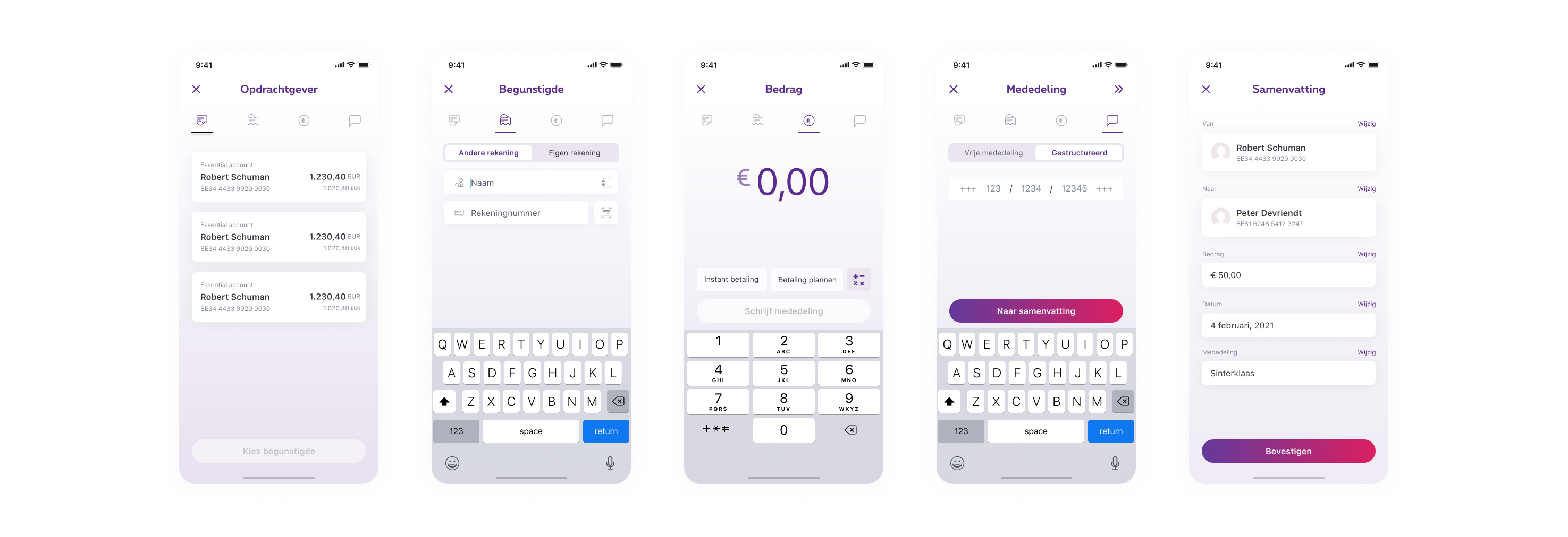
What's the meat and potatoes of a banking application? Being able to make transactions seems like a good guess to me. With Banx, there was now room to experiment with and improve the transaction flow, based on user feedback they had gathered. Improving in this sense, means making the flow more intuitive, simple, and convenient based on people's preferences. Here's what the transaction flow used to look like in the Belfius app:

The original transaction flow, as it used to be in the Belfius mobile banking app.
Looks familiar, right? You select the account from which you'd like to transfer money, who you'd like to send it to, add your amount, pick a date or pay instantly, add a statement, and finally review your transaction before sending it off. Now, let's contrast that with the transaction flow currently used in Banx. Disregard the different design and color scheme, but pay attention to the steps users go through, and how it unfolds.

The current transaction flow, as seen in the Banx mobile banking app.
It's the exact same process with the exact same level of functionality, but the flow has been shortened. Here's what happened: user data suggested a large portion of people weren't really using the date picker much, if at all. People who may benefit from a feature like this, are most likely running a business and have to set up a lot of (delayed) transactions. Hence the team decided to remove the date picker as a separate step in the flow, and rather include it as an option to the previous screen, where people enter their transaction amount.
Now, why is this a big deal? Like wow, you reduced the steps in the transaction process from five to four; congratulations. The thing is, whatever kind of services you're offering via a mobile app or website, you stand to gain everything from making it easier for people to complete actions, faster. An extreme example of this, would the transaction flow of a banking app. It's pretty much the core of their business, so you want as little friction as possible. A good rule of thumb in UX, is the less friction there is for users to do something, the more likely they'll complete the action, and maybe do more of them down the road.
So know that, from the Banx user lab testing, that the existing transaction flow has room for improvement. And we also know that the Banx and Belfius teams are very closely intertwined. Well, the impact of this change turned out to be great enough that the Belfius team simultaneously decided apply the same change to the Belfius app as well. Now, over 1,5 million recurring users can make transactions a little faster than before. Considering that scale, it's definitely worth it. A change that would otherwise be very risky to implement.

Conclusion
Now, obviously Banx wasn't created for the purpose of improving the Belfius banking app, but it does demonstrate how it can be made possible for even the most complex of products and high-stake scenarios, to still push for progress. Circling back to those two barriers I mentioned before, this subtle change to the very core of the Belfius app, used by millions, was primarily made possible because of two things:
- 1️⃣ Had it not been for user testing, Belfius would have never risked to implement that change. It needed to be validated first. And since the Banx and Belfius teams were working so closely together already, it was a small step for the Belfius app to also reap the benefits of this research. Running controlled experiments like this can tremendously speed up the innovation process and shorten the feedback loop. You can do this at whatever scale. For instance, you manually interview a handful of people and let them explore a prototype. Or you can deploy an updated version of your application or website to a certain subset of users as a sample. Facebook does this all the time, and has been doing it for years.
- 2️⃣ 15 months to launch a new banking app is pretty impressive no matter how you look at it. That's largely due to Banx having a dedicated product team to keep things moving at all times. Not only does having a multidisciplinary team drastically shorten the time to market, it can also makes is so that they can operate more freely and make decisions for themselves. Their executive power also enabled them to vet and hire external expertise that they were missing themselves. That's the beauty of having a team set up like they're an almost independent entrepreneurial unit.
I'd see this as a textbook example of how innovation or change can still sprout from within the biggest, and most regulatory confined businesses. The company itself is rarely to blame, but rather their way of working; how teams are set up and the executive power they are given to push forward and experiment.


