I’m an unapologetic travel nerd. The kind that saves pins like they’re Pokémon, over-optimizes layovers, and somehow turns “let’s just go somewhere warm” into a spreadsheet.
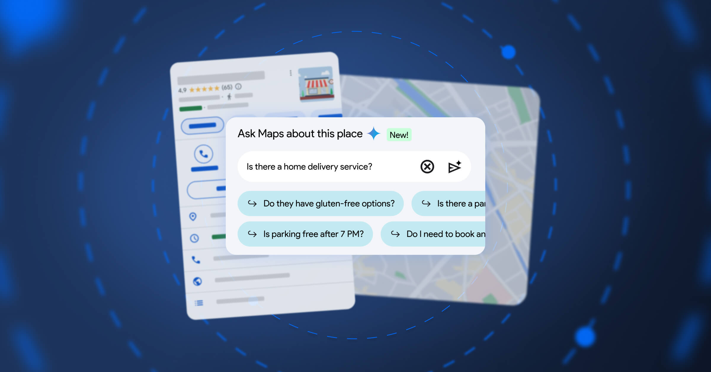
So when Google Maps started rolling out Gemini-powered experiences like “Ask Maps” (conversational answers grounded in real-world map data) and a more intuitive navigation experience, my inner traveller and my inner product person both went: yep, this is the direction. 👐🏻
Because AI in products shouldn’t feel like a gimmick or just an extra layer. Done well, it feels like momentum: less friction between intent (“I want a great day”) and reality (“I’m hungry, it’s raining, and I have 23% battery”).
Here are 3 UX principles I keep coming back to when integrating AI into a product, especially in high-context domains like travel.
1) Ground AI in the user’s reality (not just in the model)
The best AI experience isn’t “smart.” It’s specific.
In travel, your questions are always tied to a place, a time, a route, a preference, a constraint. AI becomes useful when it’s connected to reliable, up-to-date context and when the product makes that grounding clear.
What this looks like in UX decisions:
- Ground answers in real sources of truth (inventory, maps, reviews, policies), not ✨vibes✨.
- Show where recommendations come from (e.g., “along your route”, “open now”, “based on your saved places”).
- Prefer map/itinerary outputs over pure chat: make the answer actionable instead of purely informative.
If the AI can’t ground, it should say so and degrade gracefully. 😁
2) Design for multi-step intent, not single prompts
Nobody travels in one question.
It’s: “Find a neighbourhood” → “Shortlist hotels” → “Plan a day” → “Make sure we can park” → “Keep it veggie-friendly” → “Share it with friends” → “Update when plans change.”
Great AI UX treats this like a workflow with memory and checkpoints rather than a one-off chatbot moment.
What this looks like in UX decisions:
- Make it easy to iterate: refine, re-rank, swap constraints without fully starting over.
- Keep a visible plan state (itinerary, list, route) that the AI and the user co-edit.
- Turn suggestions into actions in one tap (save, book, share, navigate).
The “wow” isn’t the answer. It’s the compounding speed across the whole journey.
3) Keep the human in the driver’s seat (confidence, control, consent)
Travel decisions have consequences: money, time, safety, stress. So trust isn’t a nice-to-have … it IS the product.
When AI enters the flow, users need to understand:
- What the system is doing
- Why it’s doing it
- What will happen if they accept
- How to correct it fast
What this looks like in UX decisions:
- Make trade-offs explicit (“faster with toll” vs “slower but scenic”).
- Offer safe defaults + quick override (preferences, constraints, “undo”, “edit”).
- Use progressive disclosure: don’t flood the user, but always let them inspect.
If an AI feature increases uncertainty, it increases cognitive load and you lose the magic. 🪄
The bigger point
AI isn’t a feature you bolt on.
In the best products, AI becomes a new interaction layer that collapses the distance between asking and doing, while still respecting context, control, and trust.
As a traveller: I’m excited because it makes exploring feel lighter.
As a UX person: I’m excited because it forces us to make better product decisions about what we automate, what we surface, and how we help users feel confident on the move. 🧐
